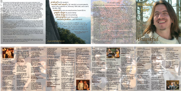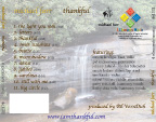
Michael is a fellow contra dancer and a real sweet person besides. This was
his first real professional job doing a CD for the "bigtime" and I
was honored to
participate in that. I have thumbnails below of the CD liner and traycard, so
to see them actual size, you can click on the links and bring up the pdf files.
 |
|
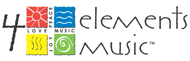
I had also done some initial design work on this recording company's logo, coming up with the central image as seen in the final logo on the pdf above.
The four elements to be represented here actually are Fire (Love), Water (Peace),
Air (Joy), and Earth (Music). 4 Elements is a
local music producer/publisher. He liked the primitive, distressed look of the
type, and wanted different icons to represent
the elements than the historical standard. I chose a playful approach, with
the sun, etc, which developed into this: